The Show Home: Understanding What's Possible for You
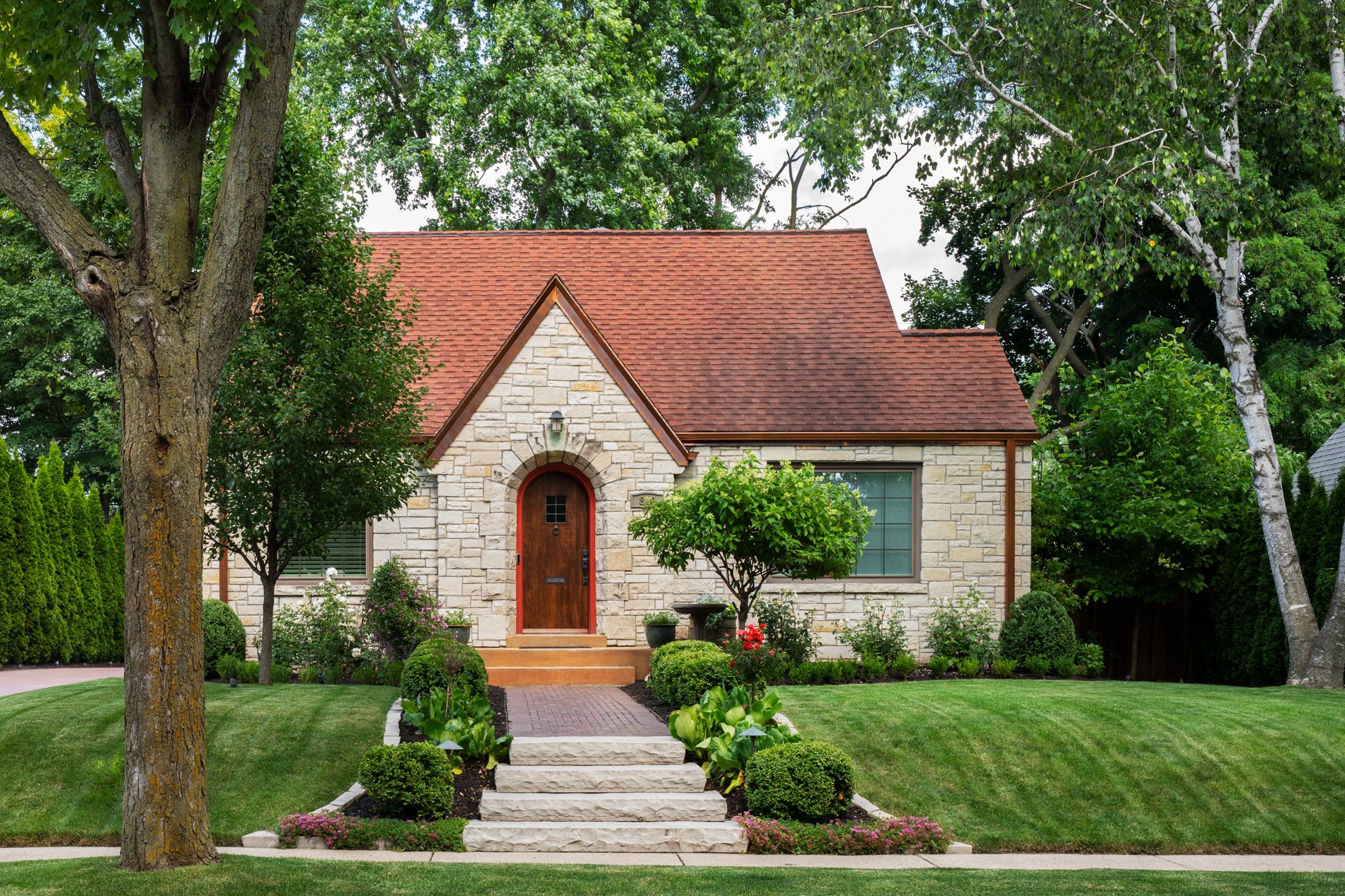
The QRS Show Home represents the comprehensive remodel of a small 1937 home in West Allis. It showcases design strategies that create both beauty and spaciousness in truly astounding ways. However, the transformation of this house shouldn’t be seen as an extraordinary example of remodeling. It’s more accurate to think of it as a demonstration of what’s possible for you and your home—when you work with QRS. In other words, the home of your dreams is closer to reality than you might think. The Show House originally had a number of seemingly “impossible” challenges that were overcome. Keep that in mind as you think about your own home.
We encourage you to take a close look at the images and learn more about the details of the Show House. Even better, if you really want to experience the Show House, we’d love to have you walk through it in person. Just let us know, and we’ll set up an appointment.
Opening up the kitchen helps turn a house into a home.
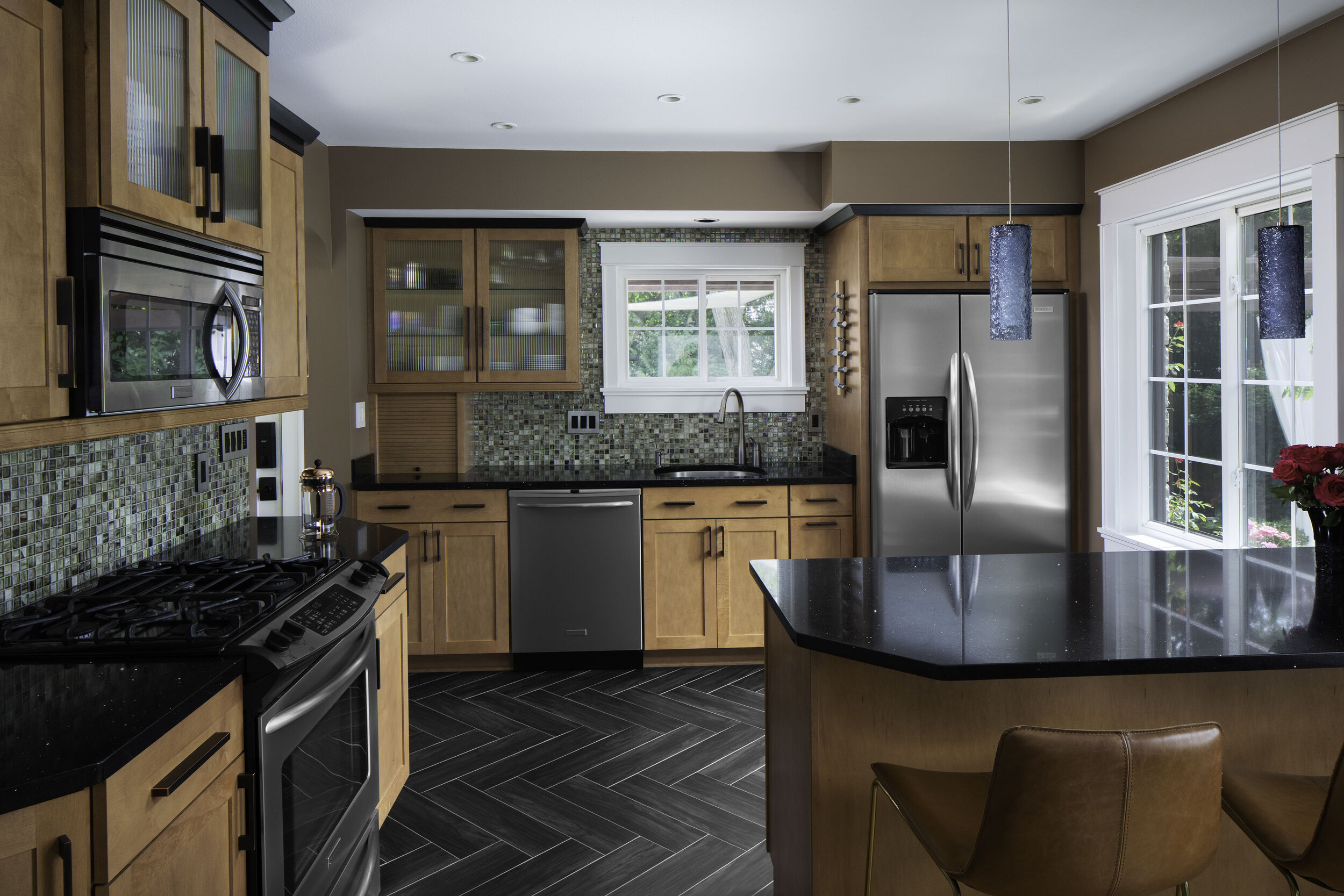
The kitchen space was originally divided from the rest of the main floor by a load-bearing wall. That design closed off—and closed in—the heart of the home, not the way most people today want to enjoy their kitchen.
With an open-concept design, the wall was removed and replaced with a recessed header. Note that the microwave and the ceiling-high cabinetry above it mark the original location of the wall division. Removing that wall and seamlessly eliminating all traces of it enabled the dramatic transformation of what many consider a home’s most important space.
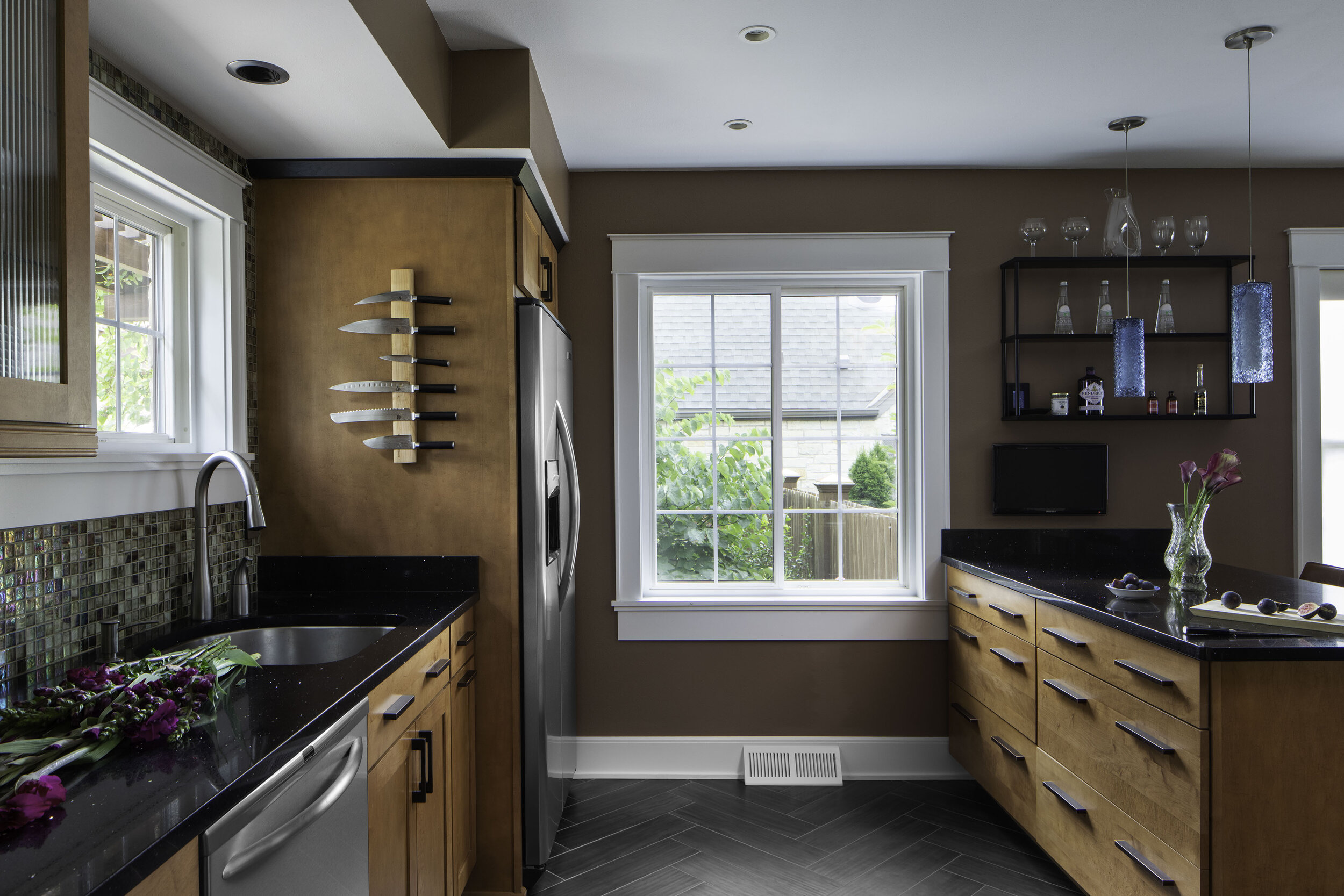
Additional new features of the kitchen include the glass tile backsplash, maple cabinetry, black quartz countertops, clipped corners for a more fluid-flowing space, and a new granite-topped dinette.
The three-inch recessed lighting cans in the ceiling result in clean, attractive, and uniform light. They also help create the illusion of a higher ceiling. Notice also the continuous under-counter lighting achieved with LED tape—a great solution to blotchy, unsightly lighting.
Good design always capitalizes on opportunities to tie spaces together. The full glass backdoor off of the kitchen affords a view of the breathtaking backyard. Also, in warmer months the kitchen windows allow audible access to the gentle sounds of the water fountain feature in the backyard (more on the backyard below).

Subtle separation: The living area within an open floor plan.
Opening up the space of the first floor continues as we move toward the living area. Here, another load-bearing wall, this time dividing the dining room from the living room, was removed. The space retains a dining area, yet like the kitchen, it’s now no longer closed-in and uninviting.
At the entry point to the living area, the ceiling header that replaced the wall was dropped down and extended to create an arch. The feature not only echoes the original archways found throughout the house but also creates a subtle division between rooms—without closing them off from one another.
This even allowed for a different ceiling color in the living area, which attractively distinguishes the space from the rest of the first floor. The living area includes a mini home theatre with a wall-mounted flat-screen TV and built-in surround-sound technology.
Rethinking the typical bathroom.
Forgoing the tub option, especially in smaller bathrooms, is becoming an increasingly popular option for practical reasons. It also creates the opportunity for innovative small-space design techniques.
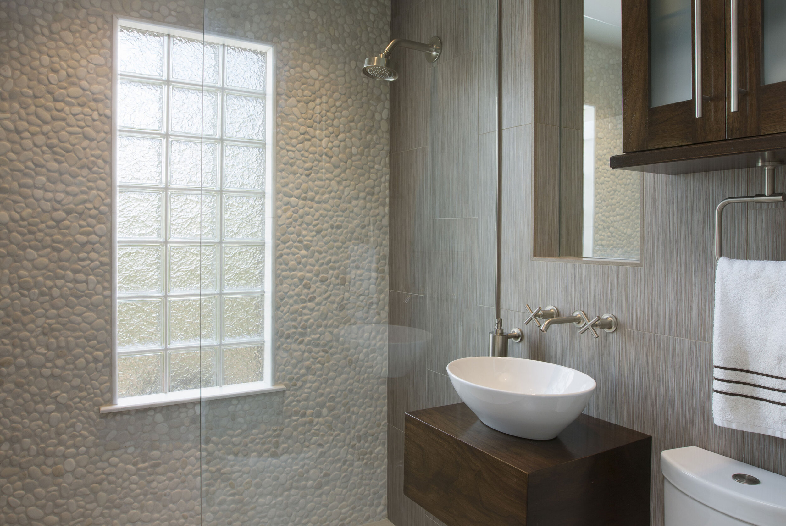
For the first-floor bathroom, which sits next to the guest bedroom, a gorgeous shower now stands where the tub once sat. Note how the shower valve at the entrance allows you to reach over to gauge water temperature, rather than stand under the showerhead. The room’s large floor tiles extend from the entry all the way through the curbless shower area, where they are pitched slightly toward a linear drain in the center. The continuous flooring helps make the room feel larger, a factor made possible thanks to the use of a clear glass shower divider, rather than a shower curtain or a semi-opaque glass divider.
Another advantage of the clear glass divider is that it gives full visibility to the unique deco tile wall, which also increases the room’s depth of space with its white color. Note that the wall itself can be seen from the hallway, thereby maximizing the exposure of such a beautiful feature.
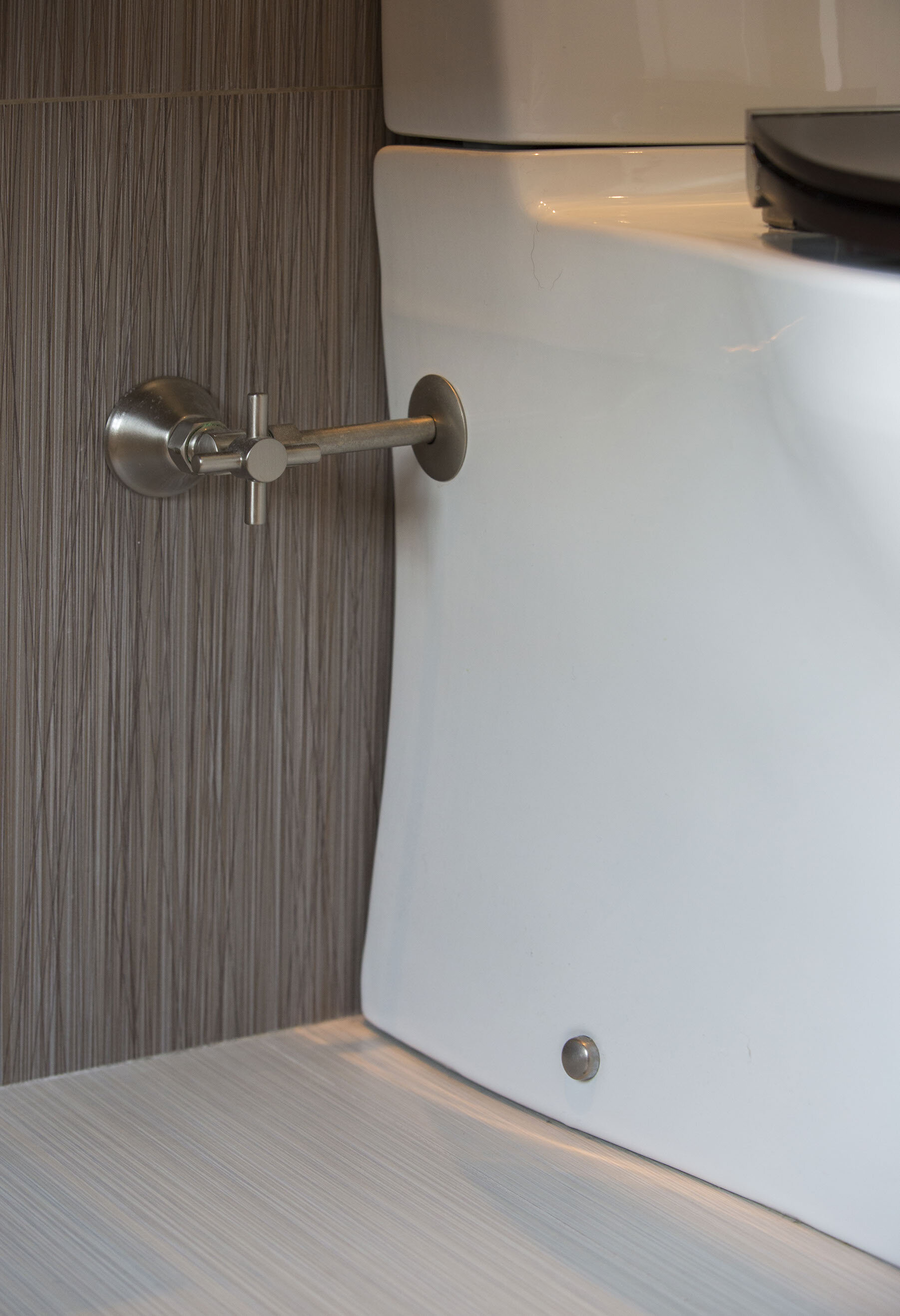
Within a small space, a few inches can make a huge difference. Case in point: The compact, heightened tank of the toilet pulls the bowl in closer and prevents it from protruding into the door space. Additionally, the toilet topper cabinetry extends to the ceiling and allows extra storage space. With its height and tall door handles, the cabinetry also creates the illusion of a higher ceiling.
And speaking of illusions, the tall mirror above the vanity helps “heighten” the ceiling—but it also does something more: Because it’s recessed into the wall, it’s farther away from your face, which actually makes the room feel larger.
Floor space was increased by elevating the vanity off the floor and having a free-standing, wall-mounted bowl sink. The plumbing is hidden within the dark woodwork of the wall-mount, which coordinates with the toilet cover and topper cabinetry.
The attic becomes a magnificent master suite
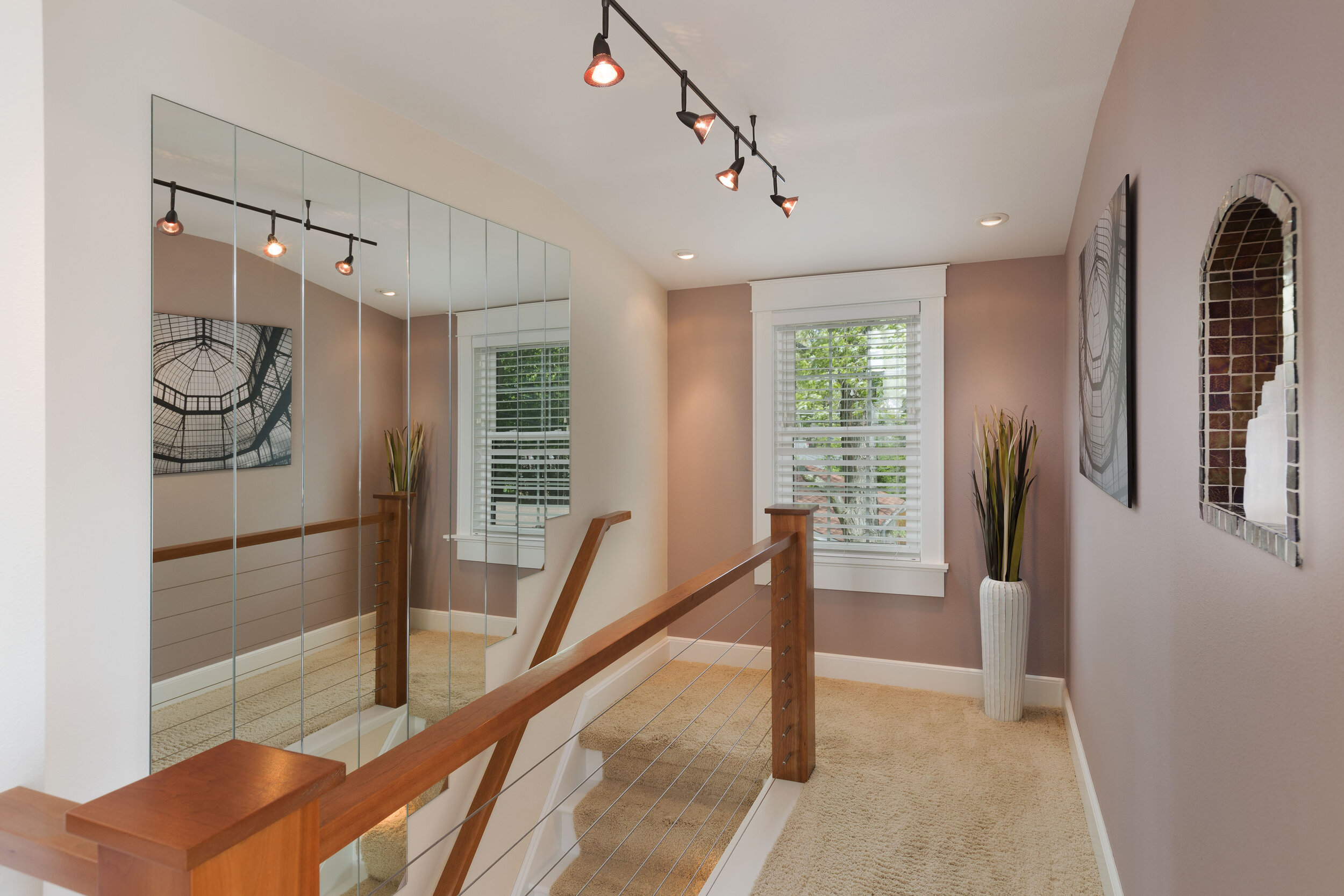
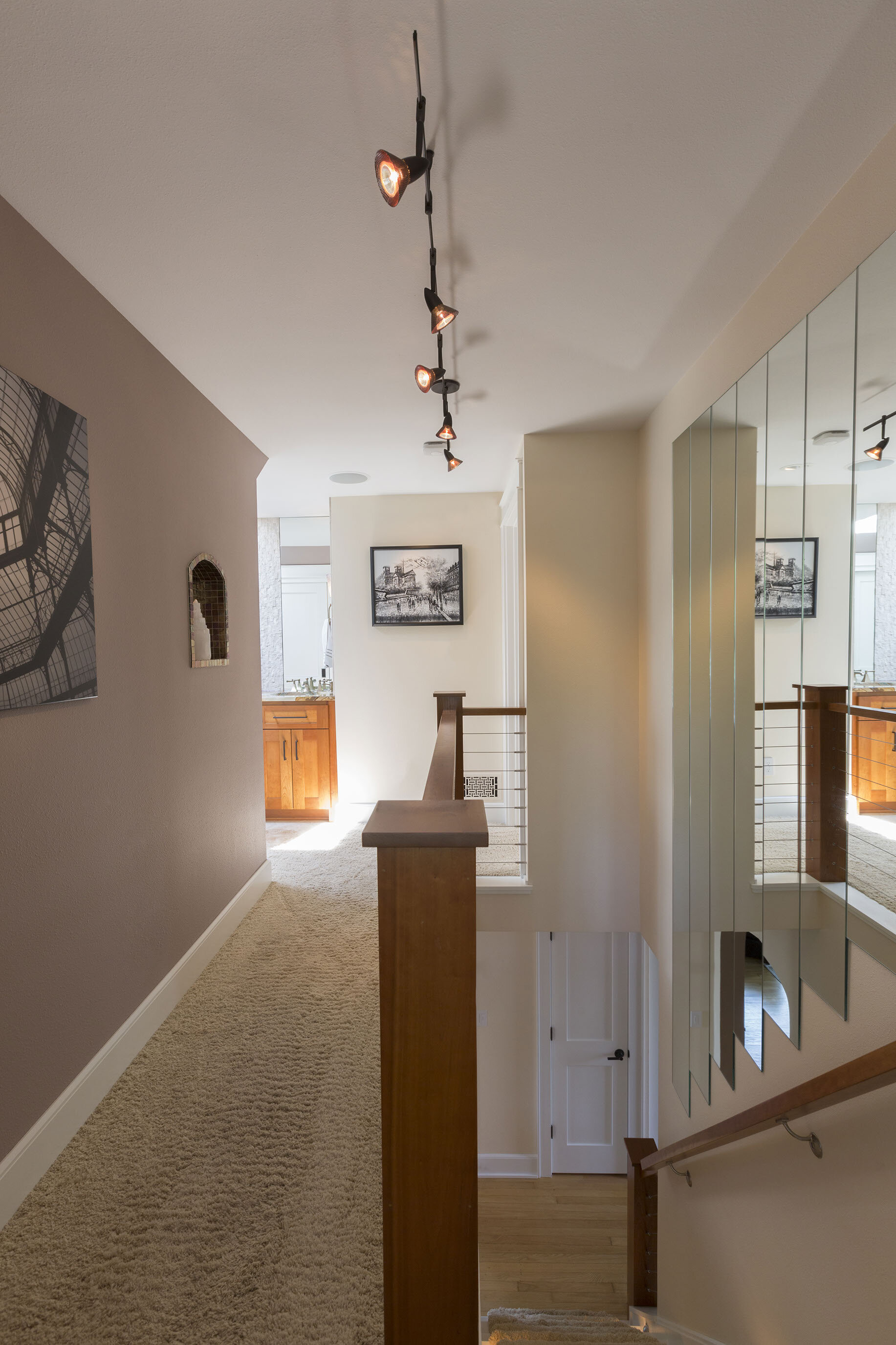
The stairwell leading up to the former attic was originally closed off by a door. This area was opened up and additions include an attractive handrail and lighted stairs, along with an arched, lighted display niche in the stairwell wall, which also initiates the art gallery motif of the attic-turned-master suite. The walls at the top of the stairs display illuminated artwork, making it a beautiful space to walk through. The modern cable railing and its partial invisibility allows a airier feel to the space, while the cherry wood of the railing adds warmth—and also ties with the cherry vanity visible at the end of the hall.
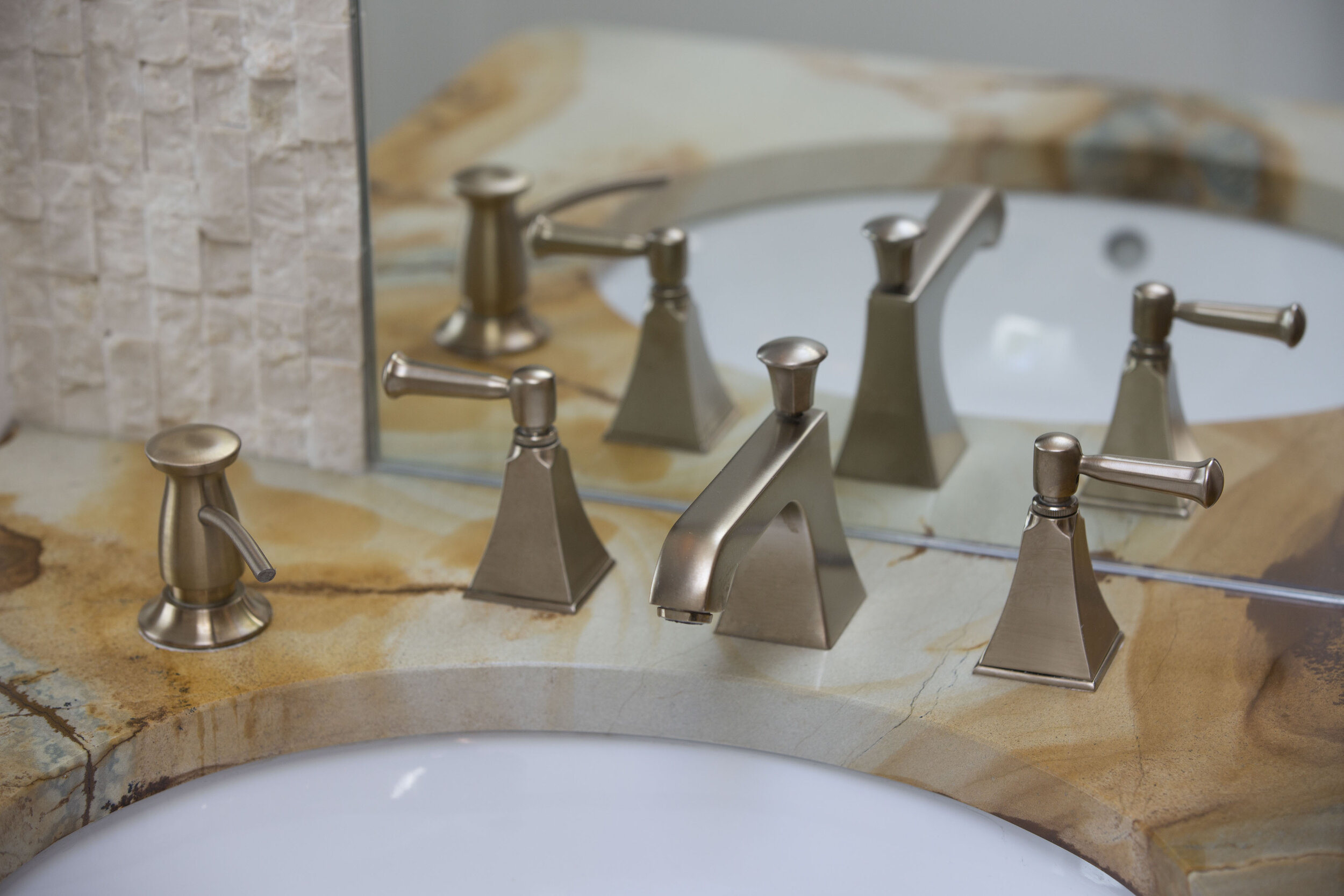
Reflecting a relentless focus on spaciousness, the design of the master suite embraces an open-concept floor plan with an exposed vanity area. Note how the vanity’s mirrors and marble wall tile reach to the ceiling, creating a heightened feeling. The simplicity of the marble provides an attractive contrast to the coloration of the vanity’s granite top. Behind the vanity area is an 8- by 3-foot closet with sliding doors, allowing for ample storage space.
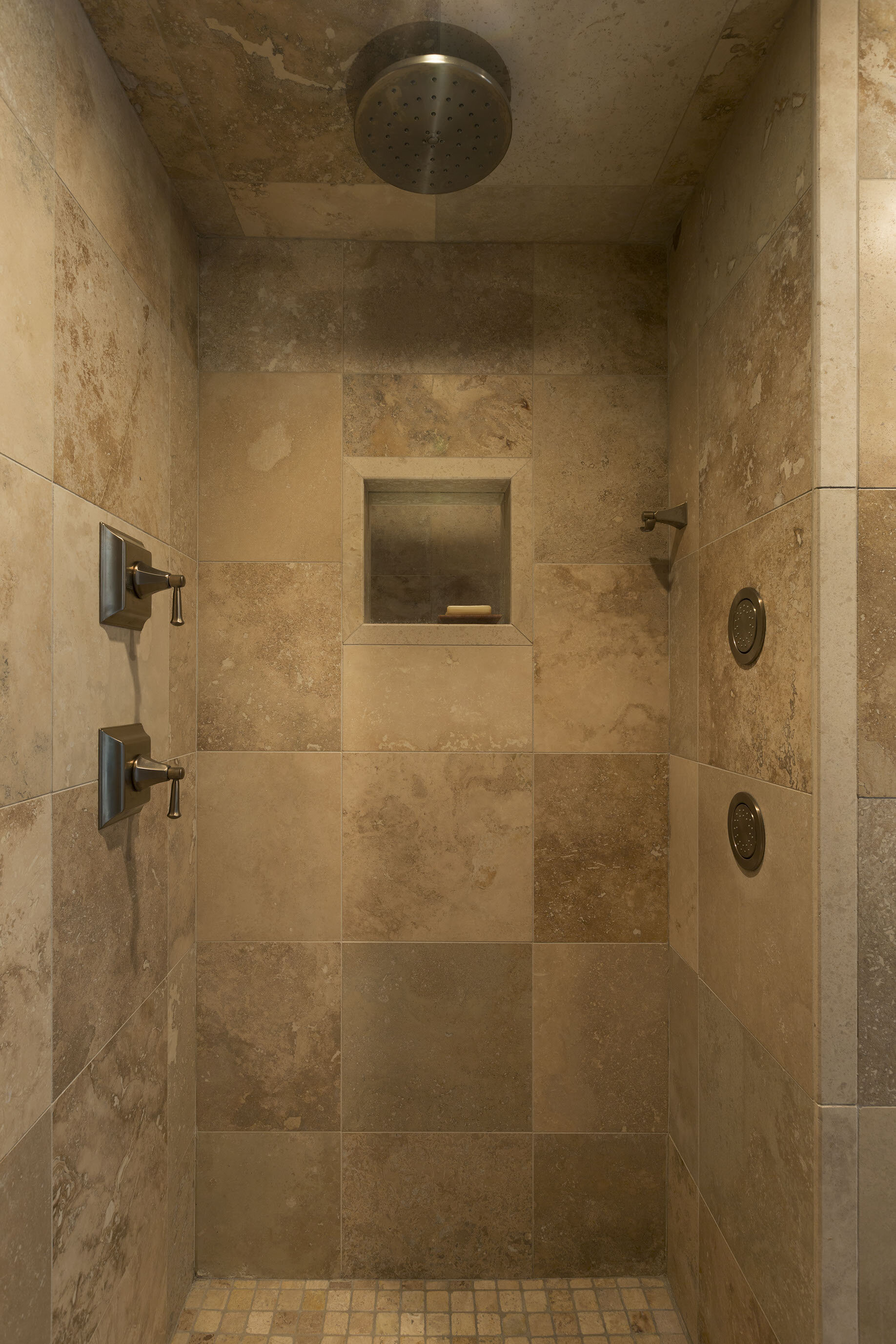
For privacy, the entrance to the master suite’s bathroom has a frosted glass door. The chimney area of the attic was replaced with an L-shaped, two-person shower, which even includes the option to watch TV. The travertine floor tile is heated—and to sit comfortably, so is the bench. One section of the shower area, the relaxation space, has two body sprays and a rain head. Next to it is the efficiency side, with a conventional showerhead emerging from handmade stone-and-glass Mexican tile.
For the knee walls in the bedroom area, additional storage—and a display feature—was created with recessed cabinetry on one side. On the other, drawers that get progressively deeper from top to bottom were installed, which eliminates the need for an additional dresser and allows for more floor space. A keystone-shaped skylight allows for more natural light and also creates an interesting ceiling feature.
The entire master suite area has built-in AV options for listening to or watching TV wherever you are.




Goodbye basement: The lower level’s whole new world.
It now seems almost unimaginable that this lower level was once your standard unfinished—and slightly dank—Wisconsin basement. The redesign has eliminated any trace of that. The floor was re-poured and leveled, the entire basement was sealed off with spray foaming and waterproofing, and all tiled-floor areas are heated.
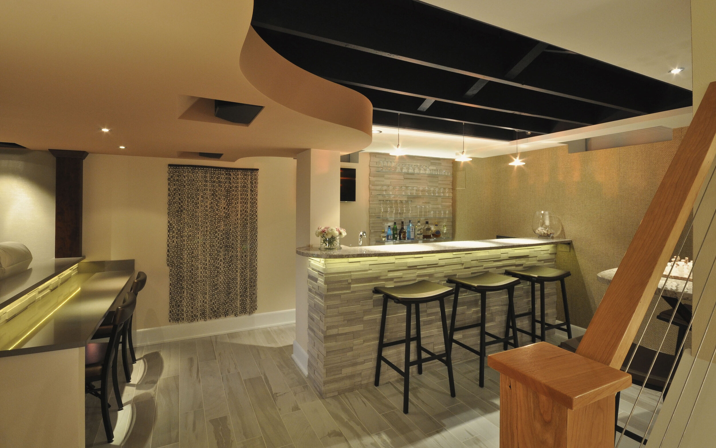
The stunning new bar area provides plenty of seating and includes a number of beautiful features. Note the wall behind the bar, which has honed stacked-stone marble with recessed glass shelves, as well as cabinetry below. The space under the bar includes an under-counter microwave, dishwasher, and glass-door beverage center.
The open rafter ceiling allows for more height and adds a unique dimension to the overall space. All windows are semi-opaque glass block. The area also includes woven-grass cloth wallpaper, which is an attractive wall feature in and of itself, and lighted recessed display cases for art work or treasured mementos.
The beautifully curved ceiling soffit conceals speakers, HVAC ducts, and plumbing works. Looping throughout much of the lower level, the soffit artfully suggests a spool of unwound film—a decorative nod to what may be the lower level’s most exciting feature: a dedicated modern home theatre.
The ultra-wide 110-inch curved screen eliminates the black strips across the top and bottom of the display and allows a movie to be viewed in its full splendor. Extra-comfortable theatre chairs include an internal rumbler feature, which allows bass sounds from the movie—imagine the footsteps of a T-Rex—to reverberate within the chair itself.
The area beneath the screen conceals a subwoofer, bass traps, a center channel speaker, and HVAC ducts that pass air through the acoustically transparent fabric. The center ceiling, dark in color to enhance the screen’s picture quality, contains built-in Dolby Atmos surround-sound speakers. The side soffits house the latest in sound system technology with DTS Neo X speakers.
All theatre components are easily accessible within the furnace room behind a tinted glass door, where they remain dust-free.
The lower-level bathroom includes a sumptuous two-person soaking tub and an option for watching TV. Other features include the simple beauty of the pedestal sink and the clean, attractive look of 1- by 2-inch wainscoting marble tile, which reaches halfway up the wall. Because of the tile’s small size, it can be curved beautifully around the tub.
An efficiently arranged and equipped workout room includes a TV, mirrors to enlarge the space, and impact-resistant rubber flooring, which also prevents a cold floor. Double-doors conceal the furnace room, which also includes additional shelving. The lower level isn’t all about luxury: it also contains a space-efficient laundry room.



Outdoor living: A backyard beyond beautiful.
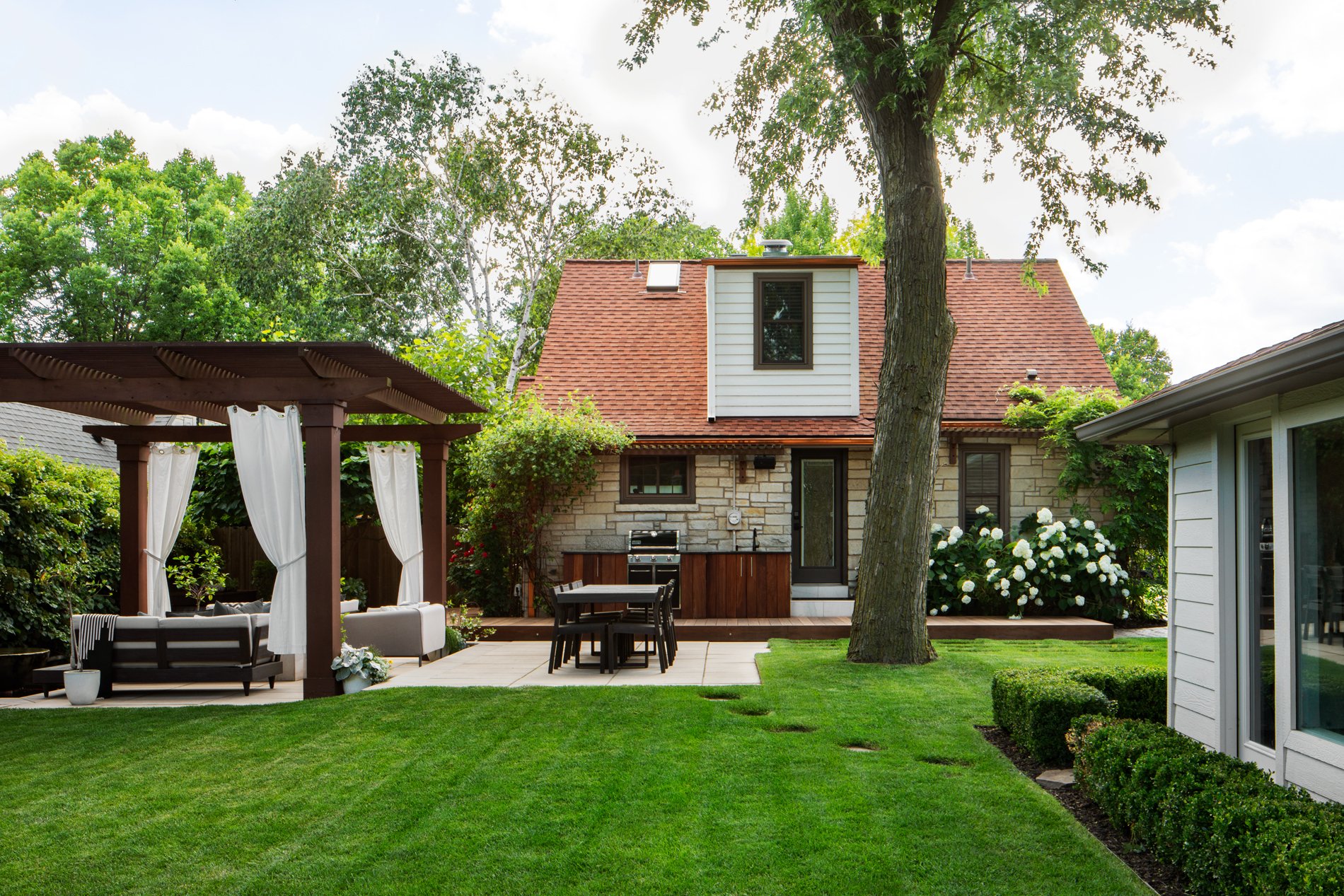
The original backyard area was completely gutted. The new features create an irresistible area that’s not only meant to be enjoyed—it’s an inviting space that demands to be experienced.
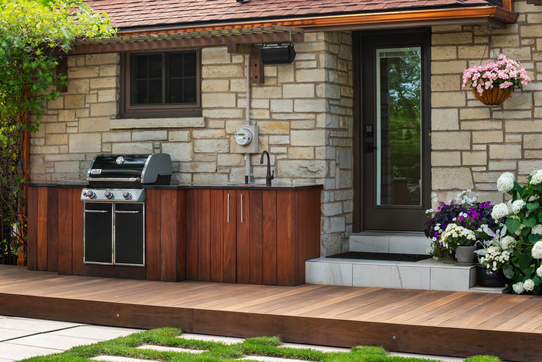
The new deck, a gorgeous walkway made of Brazilian walnut, serves as the base for the outdoor grill and kitchen area. Above the kitchenette space, recessed LED strip lighting allows convenient nighttime grilling. Attractive cedar eyebrow trellises above the deck coordinate with the backyard’s pergola and fencing, and will eventually hold twining vines.
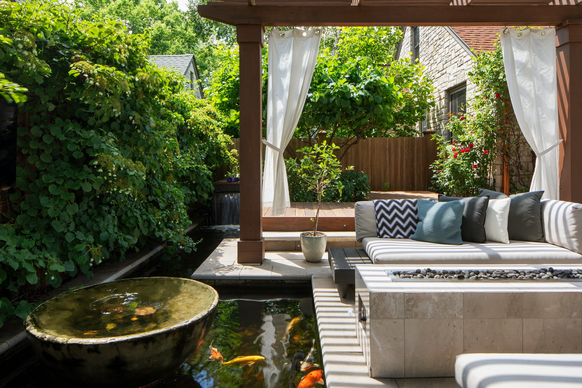
At one end of the deck, you can dangle your feet in the water next to the waterfall feature of the koi pond, or enjoy the warmth of the sun as you recline in one of the lounge chairs situated in a private relaxation area.
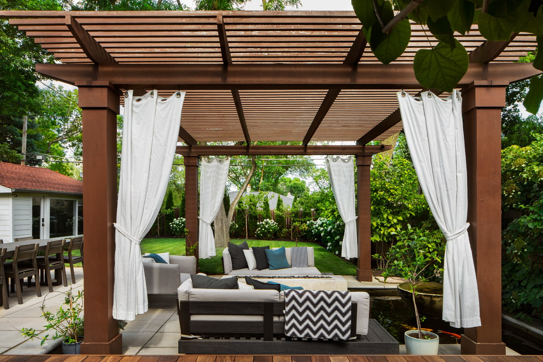
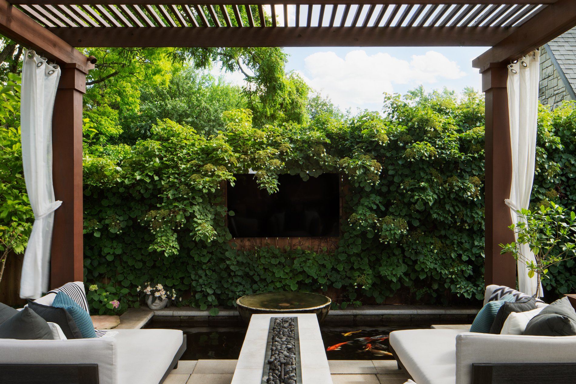
Next, step off the deck onto large pavers that set the scene for an enchanted seating area for six beneath the cedar pergola. At night you can enjoy the warmth and beauty of the gas fireplace, along with the illuminated pond, which fills into the pergola area and features a beautifully lit overflowing water bowl in the center, not to mention 20 colorful koi. The branches of the magnolia trees around the entire perimeter of the fence light up at night with energy-efficient LED lighting.
Other features of the outdoor living area include strategic lighting for safe stepping, gapped pavers growing creeping thyme, lattices with a creeping hydrangea that will eventually create a flowered-wall effect, and the cedar fence surrounding the entire backyard, which adds both beauty and privacy.


